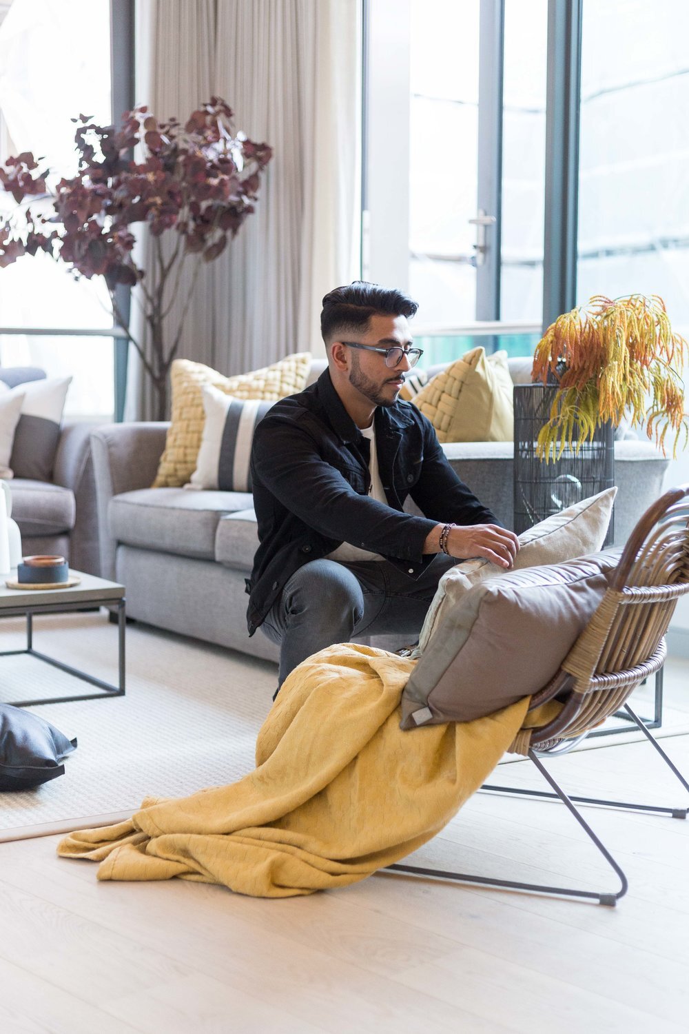
Bankside Apartment Makeover_
We cannot tell you how excited we are about showing you our latest project, it's been several months in the making, but finally, we can reveal the super hard work achieved by my extraordinary team who work behind-the-scenes to make Space Shack's vision a reality. As we mentioned last week, we were approached in May to renovate an apartment by the Thames river at Bankside, home to the Tate Modern and Shakespeare's Globe Theatre. A fantastic location for any city worker who wants a place to reside right in the centre of the city with views of iconic London just outside their front door.
Our client is a corporate banker who lives on the outskirts of London for most of the week but decided to purchase this additional apartment so that he could be closer to work during the week. He reached out to us after seeing our work on Instagram and blog as he needed an interior specialist to turn it into the place the home deserves to be as he never seemed to have the time to do it up himself.
Images: Space Shack
The brief was simple:
A dedicated area to house his growing number of books he collects
A new flooring solution throughout to brighten up the entire space
The installation of some new air conditioning units to prevent the apartment getting too hot in the Summer
What do we plan to do?
After talking through all requirements, we identified five key areas of renovation:
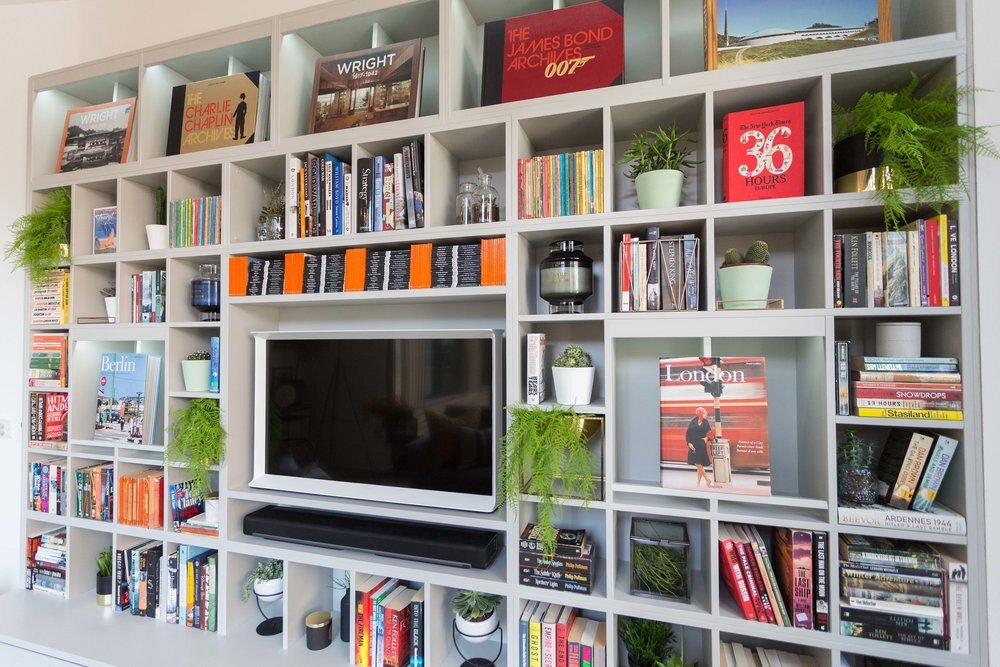
Design and installation of a bespoke modular book shelving including a media solution
New flooring throughout the entire apartment
General repairs throughout the hallway and living area
New paint and a clean up of all severely damaged walls and woodwork
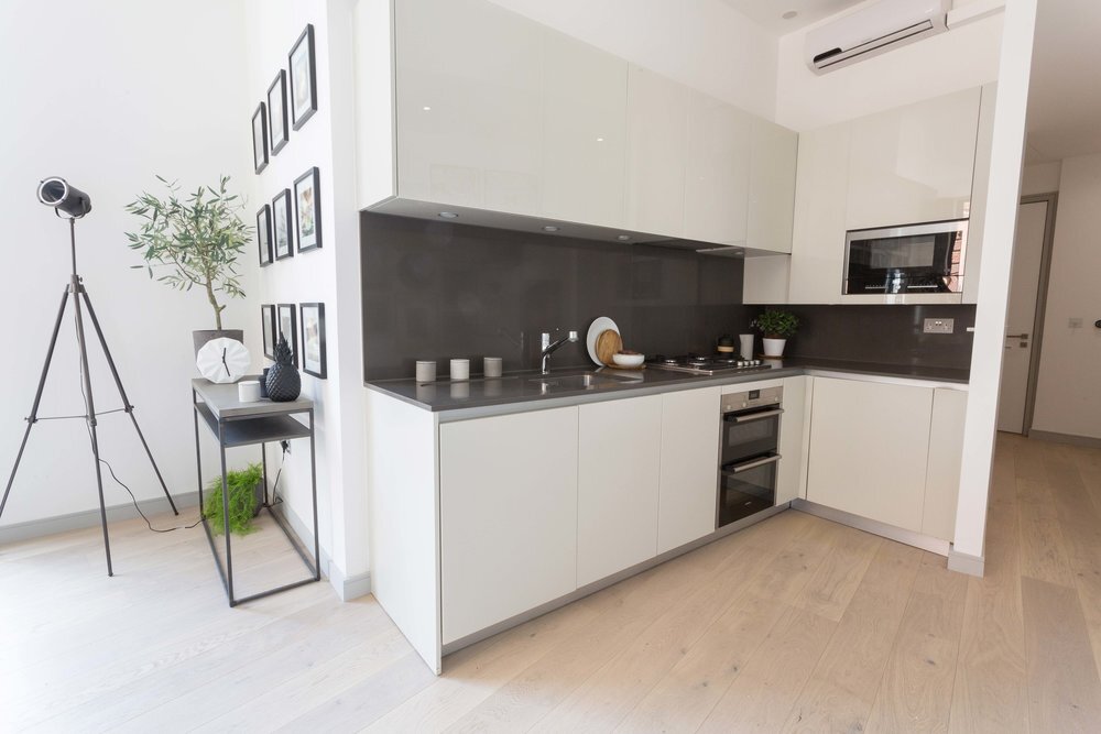
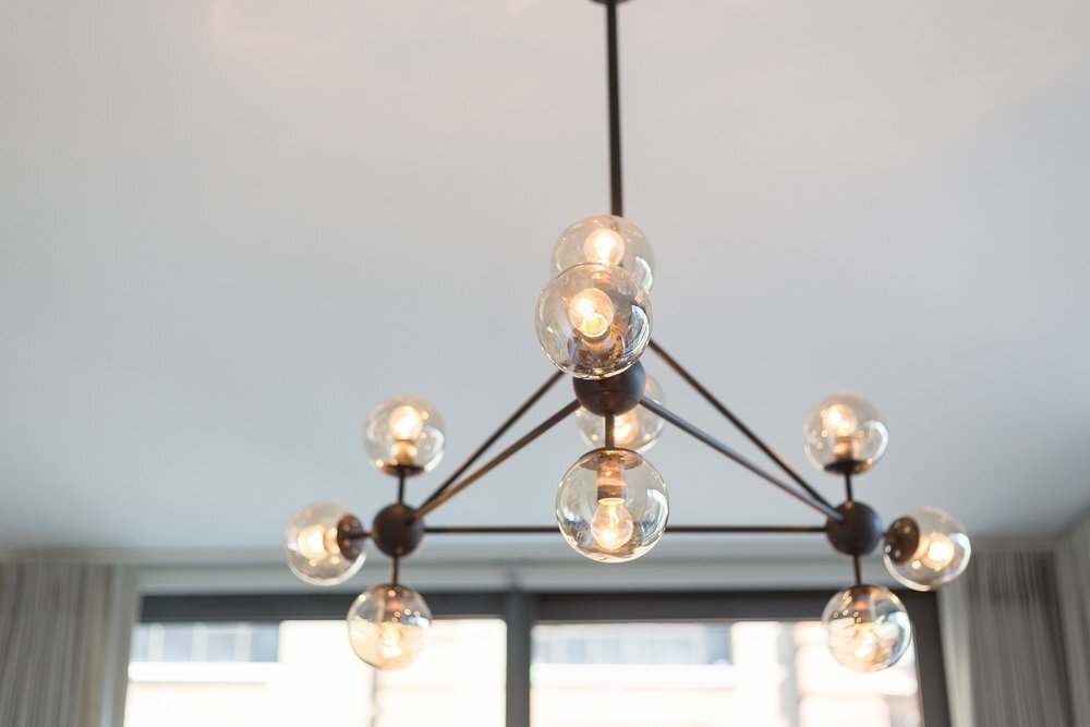
New lighting solutions for all spaces throughout the living and kitchen area
The Transformation
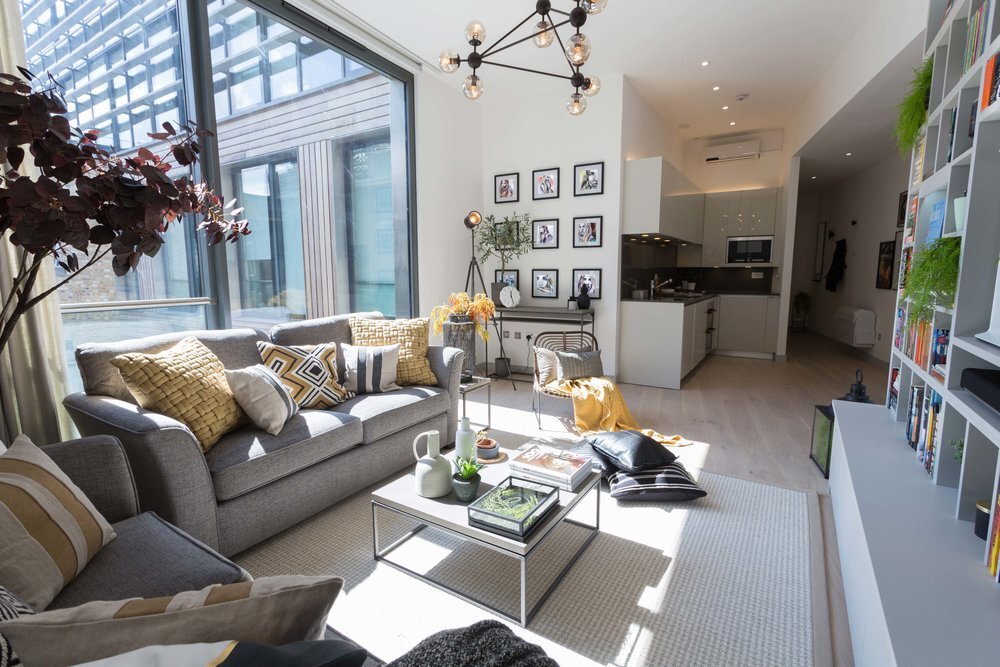
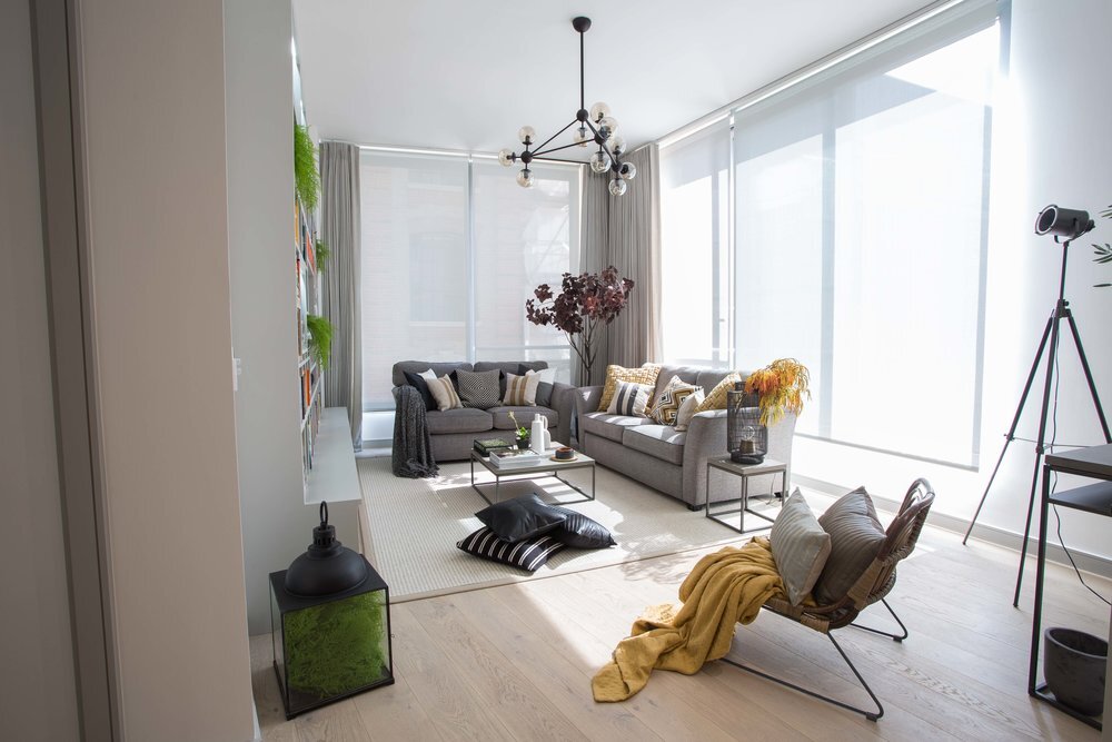


Images: Space Shack
Air Conditioning
We could tell from the moment we stepped into the flat that sunlight was a blessing in the sense natural light is key to any home looking bright and inviting but also a curse as you are essentially living in a greenhouse during the summer months. After obtaining planning permission we fitted Olympia Twin Inverters in two key areas which literally breathed new life into the apartment making it considerably cooler!
Flooring
We removed the existing dark brown walnut flooring and replaced it with a refreshing 2.4m length white-washed engineered oak which adds quite a bit of character to the entire space even before we added new furnishings. These colours were chosen to complement the soft grey farrow and ball paint we used for the book shelving, skirting and architraves. This tied in the whole design scheme and added a touch of class. This kind of flooring is almost timeless and the neutral colour will ensure it will go with any future decor changes.
Shelving Unit
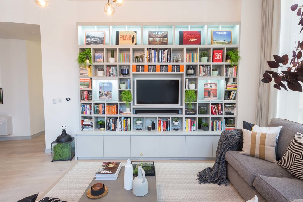
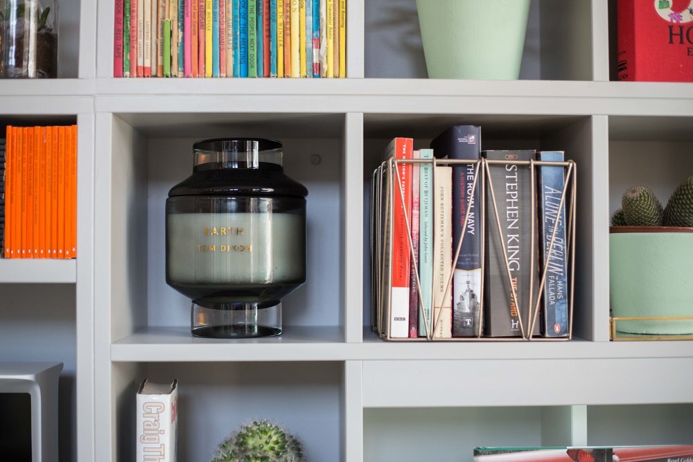
The shelving solution is one of our most proud achievements of this project, a key part of our clients brief was to accommodate his love of books which meant investing in designing and building modular shelving for an entire wall, making this new feature an essential part of the space bringing the entire design scheme together. Existing bookshelves from places such as IKEA don't usually fit large coffee table books and purchasing too many of these independent bookcases can turn your home into something resembling a shop interior if you're not too careful! We invited Jack from Leith Furniture to check out the apartment and started collaborating together to come up with a symmetrical cube-like shelving system which would house his books, ornaments and new Serif TV and store and hide all the electricals in the base units. Jack's incredible carpentry skills paid off and we are so happy with the end result! The best part of this modular shelving so he could display his favourite hardback Taschen books in various display boxes, we also added a nice touch by adding mini backlights to give key books in his collection that spotlight glow at night.
Image: Space Shack
Styling
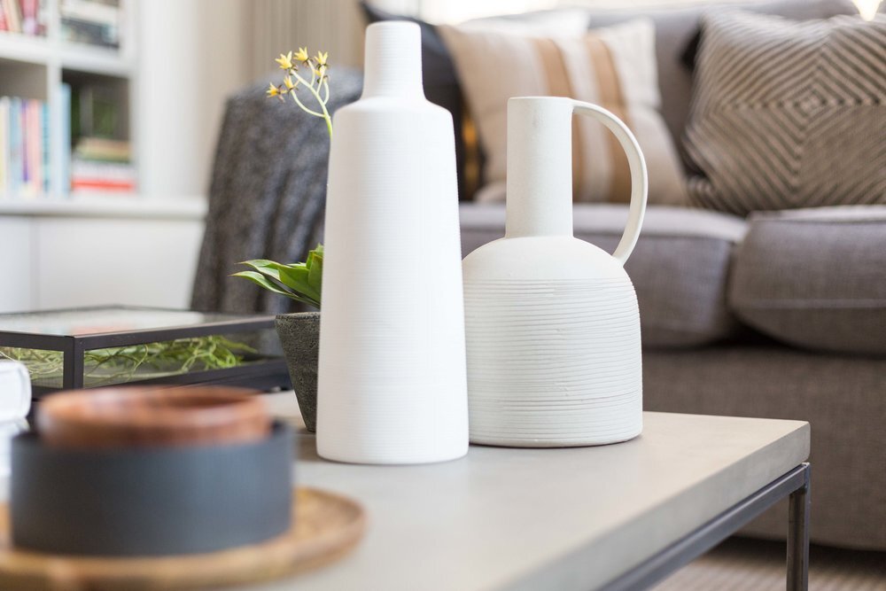
We wanted to complement the base colours of the flooring and walls and as this apartment was primarily white and various shades of grey, we wanted to introduce mustards and monochrome tones to bring some warmth and accentuate the natural sunlight that pours into the living area during the daytime. Our client had only just purchased his sofas, so we lifted up the dull grey tones of the material by introducing shades of mustard and lighter greys with textured and patterned cushions from H&M Home and Zara Home.
Image: Space Shack
Image: Space Shack
Next week we will go into a bit more detail about the air-conditioning and the practical considerations required when considering a major overhaul like this to your home.
Love Omar x
To contact us or find out more about Space Shack arrange your Design Discovery Call or follow us on Instagram and Facebook.


