
How we transformed this Docklands city apartment Into a contemporary home_
Our latest clients were a professional couple that wanted to move back into their previously rented flat. The clients asked us to refresh and redesign the entire space so the flat would have a completely new look and feel like a new home again.
This two-bedroom apartment is part of a new build development overlooking Canary Wharf. The views of the river are stunning, and once inside, you can immediately feel the strong connection between water, architecture and contemporary living.
As the clients have beautiful contemporary prints, it came naturally to design the entire space around them and use key pieces as inspiration to lead the rest of the design. We carefully selected new furniture and soft furnishing to create a unique and sophisticated look. In addition, we introduced new colours and materials, taking into account the location of the flat and the overall neighbourhood atmosphere.
Come on in and have a look!


Images: Space Shack
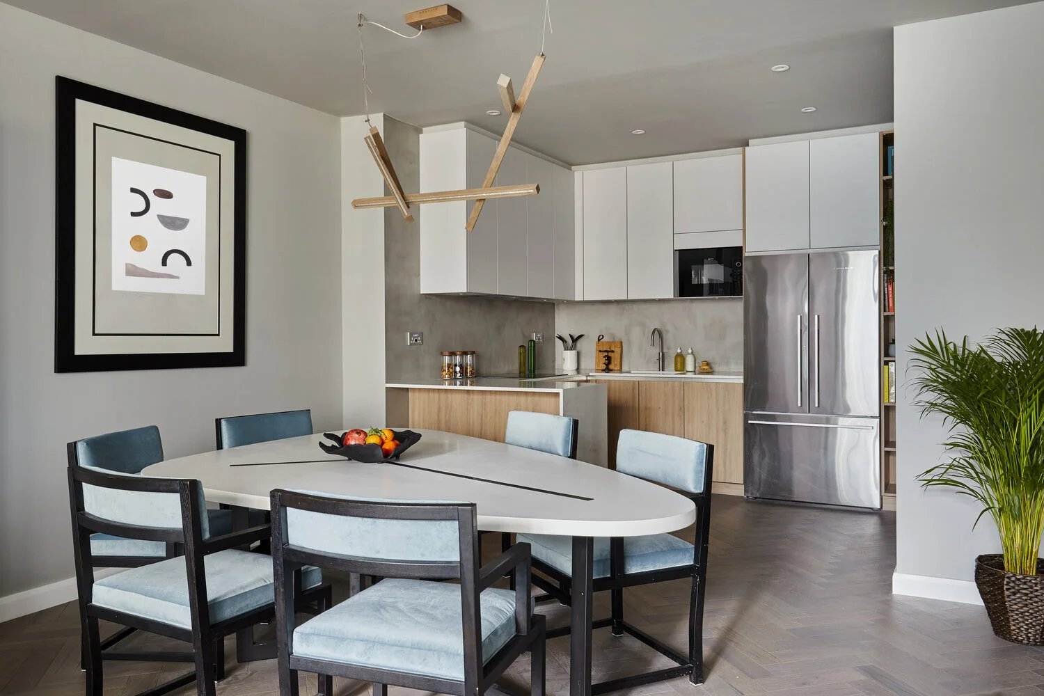
LIVING ROOM + KITCHEN
One of the main requests from our clients was to remove the original stud walls between the kitchen and the living area. This simple removal allowed us to have more natural light coming through the kitchen area and create an open plan living space. We transformed the kitchen layout from the original U shape to an L shape with bar seating two people. The kitchen has been supplied by Schmidt Kitchens.
As the client wanted a neat and contemporary look, we opted for oak cabinet frontals for the base cabinets, light grey for the upper ones, white quartz marble look worktop and stainless steel metal hardware. All integrated appliances were from Neff, and we featured a Fisher & Paykel freestanding American style fridge/freezer. The clients also wanted to explore different materials for the splash-back: it came naturally to suggest concrete/micro-cement as an option - as it was a great contrast with the other materials. The overall outcome is a contemporary, timeless looking kitchen that allows our clients to entertain guests and cook their favourite recipes.
Next to the kitchen is where the existing B&B Italia dining table sits. To refresh this area, we reupholstered the seven dining chairs with a light blue velvet and hung a sculptural chandelier above. Besides the lounge area, we replaced the old sofa with a curved, extremely contemporary B&B Italia sofa: thanks to its shape and the round rug, the area is defined, welcoming people to take a seat and relax. We kept the existing media unit, bar unit and bookcase. The entire room has been completely transformed compared to the original layout, and each zone works on its own and in the entire open space.


Images: Space Shack
MASTER BEDROOM
The brief for this room was to create a luxury hotel room look while keeping all the existing furniture - this was going to be a challenge! We, therefore, worked on the walls, stripping off the existing wallpaper and redesigned the feature wall behind the bed by using different materials and textures: floor-to-ceiling brass tinted mirrors, fluted wooden panels with integrated LED lights and concrete. We reupholstered the small to seater sofa with a grey patterned fabric too. Pendant reading lights finish the look off from Wayfair. We are very proud of the final result, the room has been completely transformed, and the beautiful tree art is an integral part of the design and really brought the entire space together.


Images: Space Shack
ENSUITE
This space is the one that had the most structural work involved. Originally the ensuite was a small 4sqm space, accessed by a narrow corridor with built-in storage on one side and the entrance to the existing en suite door on the other. As the clients requested a larger walk-in shower, we decided to incorporate the corridor space into the ensuite. The room is now double the size with an 800x1500 walk-in shower, a double vanity unit with a recessed mirror and built-in utility storage where we placed the washing machine and tumble dryer. We used Travertine like tiles for the flooring, Invisible grey marble-like tiles for the walls and concrete in the shower enclosure. To give a warm and feminine touch, we painted the ceiling with a smooth pink ‘Calamine’ from Farrow and Ball.


Images: Space Shack
GUEST BATHROOM
The layout of this room hasn’t changed much compared to the original design, as we were limited by supporting walls and steel beam. The final result is completely different: a free-standing bathtub, a wall to wall bespoke vanity unit and a made to measure big mirror make this small room look not only bigger but elegant. The flooring is the same one as in the ensuite; the walls, on the other hand, are tiled with white Carrara Marble look tiles.


Images: Space Shack
THE FINAL LOOK
The overall result is a luxury yet minimal apartment where neutral colours, materiality and artworks are the focal points that guide you throughout the whole space. The striating point for this project was to ‘keep it simple' - we didn't want to overcrowd the space but to let the pieces talk for themselves instead. Sometimes it is easy to get carried away with the excitement of buying lots of new accessories and furnishings for your new home, but taking the time to think about what you really need, will make you appreciate every single object in your space.


Images: Space Shack
Let us know if you’d like to know more about our amazing Docklands City renovation, as we’d be more than happy to share further details with you!
Love Omar x
To contact us or find out more about Space Shack arrange your Design Discovery Call or follow us on Instagram and Facebook.