Transforming Spaces: Inside the Seamless Interior Design of Our Latest Renovation Project in Canary Wharf
Ready to delve into the transformation of an apartment in the bustling hub of Canary Wharf? Our recent project was driven by the vision of a young couple whose lifestyle and aesthetic sensibilities resonated with our design philosophy.
The couple who has been following our work for a little while, appreciated our journey from concept to completion, resonating with our penchant for simple elegance infused with hints of glamour and bursts of colour. With their busy schedules, they entrusted us with the entirety of the project, confident in our ability to align with their desires for a practical yet stylish living space.
Our clients were engaged at each project milestone, providing invaluable feedback while leaning on our expertise to guide the overall direction. Their request was clear: incorporate Japanese minimalism and Scandinavian functionality into a home that accommodated their beloved Chihuahua and Pug and was flexible enough to welcome a new baby.
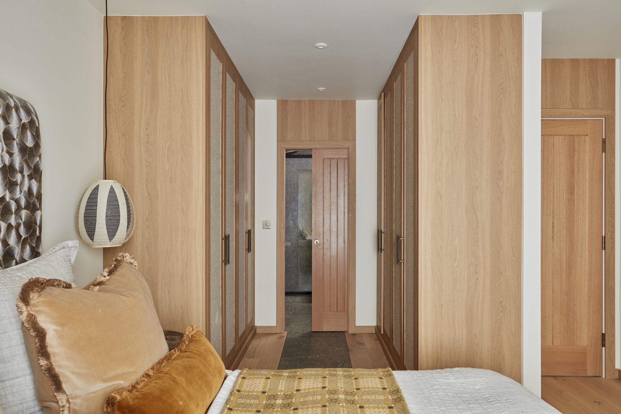
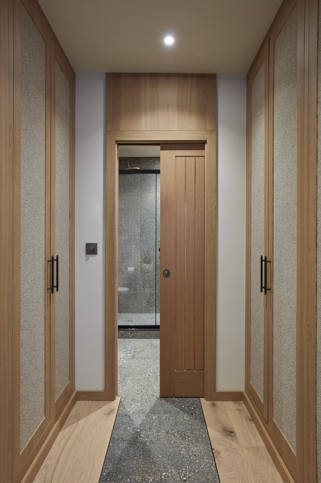
The primary goal was to maximize the compact London living space. We redesigned the layout to feature a bespoke walk-in closet tailored to their storage needs, now leading to the ensuite bathroom being separated by an innovative pocket door which overall created a seamless flow.
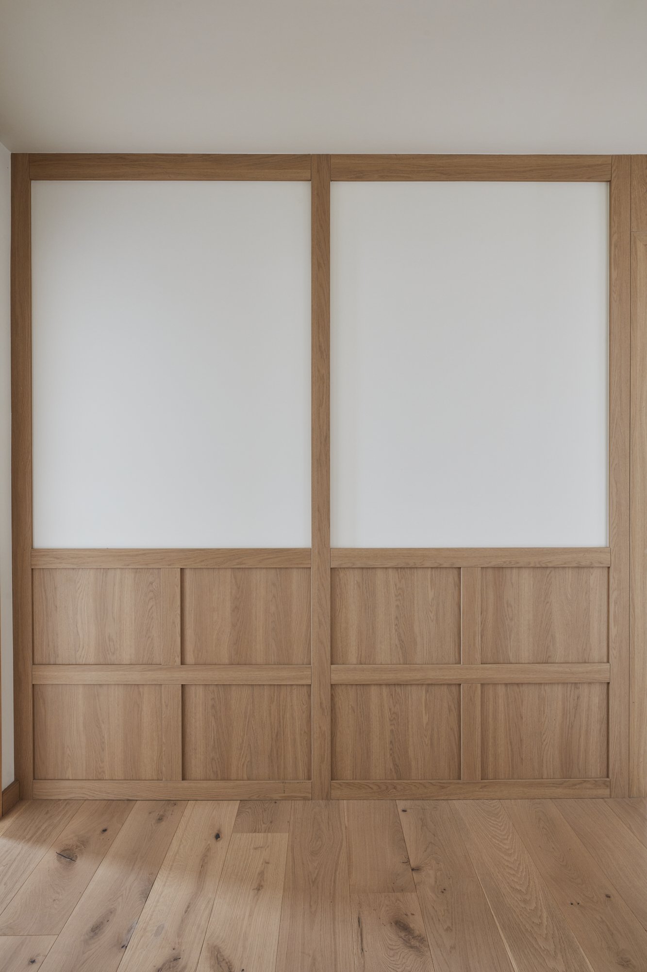
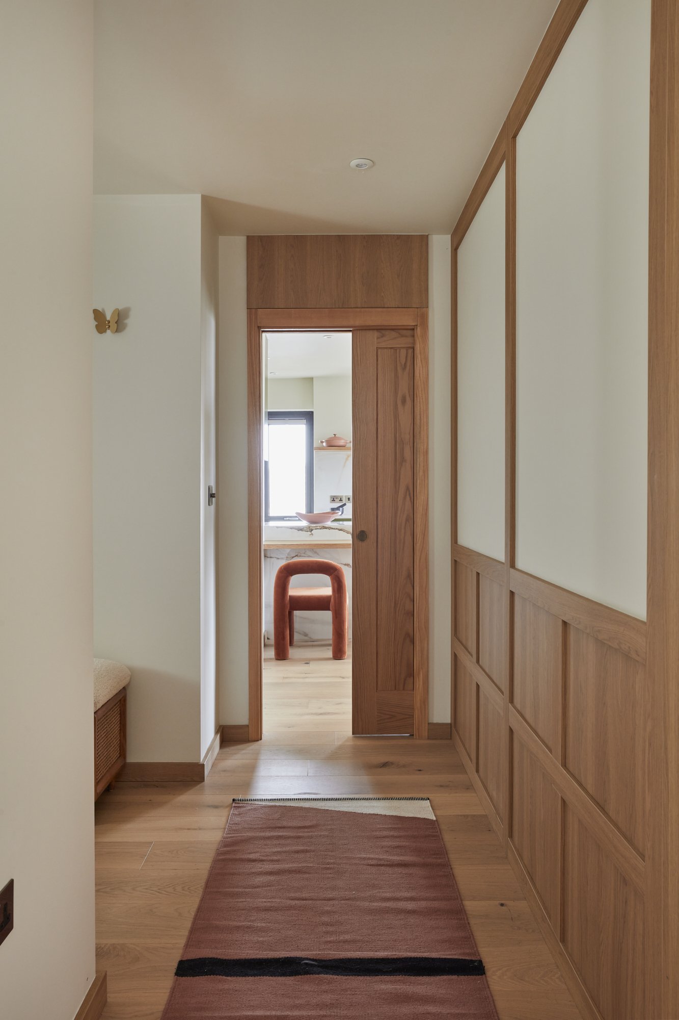
Durability was a top consideration, with sturdy materials and washable paints taking precedence. The oak panelling in the hallway not only added aesthetic appeal but also functioned as a durable element in a high-traffic area, especially with pets in mind.
The transformation's most gratifying aspect was witnessing the clients' sheer delight with the finished apartment. The seamless integration of custom oak joinery throughout the apartment created a cohesive design that anchored the entire space.
Creating a successful interior scheme for this project began with defining the purpose of each room and listing all storage requirements. We advocate designing around storage solutions, turning functionality into a feature of the space. It's essential to have an all-inclusive budget with a contingency plan, considering all project elements. Most importantly, maintain an openness to change, allowing the design to evolve as the project progresses.
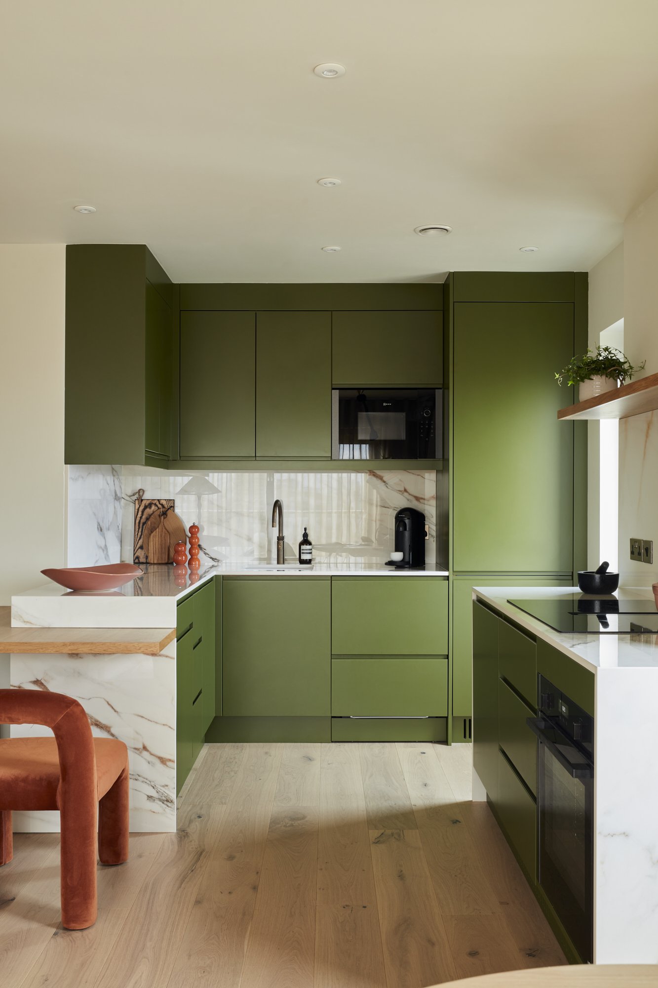
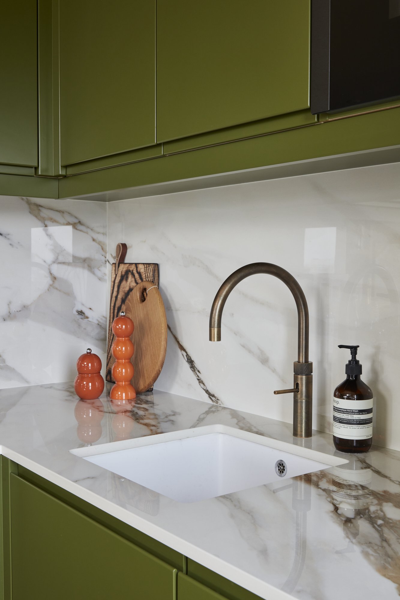
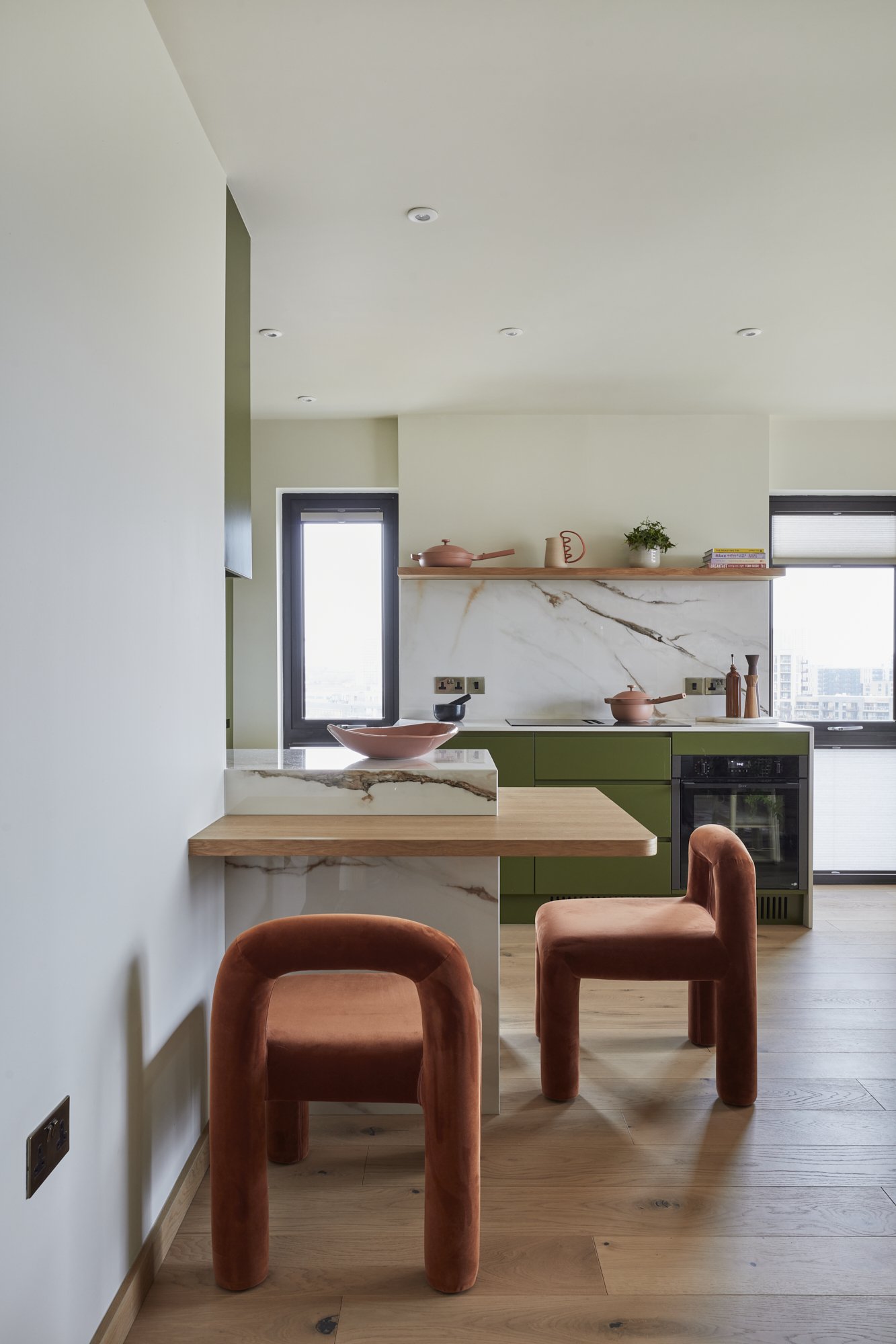
For a closer look at the individual elements of this project, such as the kitchen's marriage of glossy porcelain with antique-effect bronze hardware or the nursery's adaptable design, scroll through the below gallery. Each image is accompanied by detailed captions that share our creative choices that make this Canary Wharf apartment truly one of a kind.
THE KITCHEN_
In the kitchen, a blend of warm oak worktops and a neutral-toned floor sets a harmonious stage, letting the crisp cabinetry and dynamic accessories truly stand out. Even with its compact dimensions, this space boasts ample storage and generous countertop areas.
THE DINING AREA_
A charming circular oak table takes centre stage in the dining area, providing a gentle counterpoint to the room's clean, linear elements.
THE LIVING ROOM_
This panoramic view showcases the effective use of a compact area, which maintains a tranquil and uncluttered atmosphere while offering all the essentials for a comfortable, contemporary lifestyle.
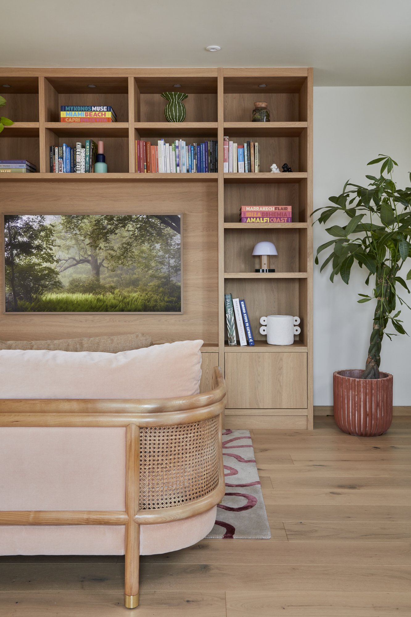
THE MEDIA UNIT_
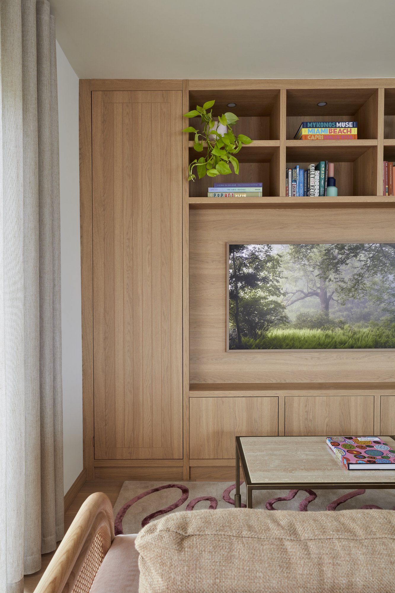
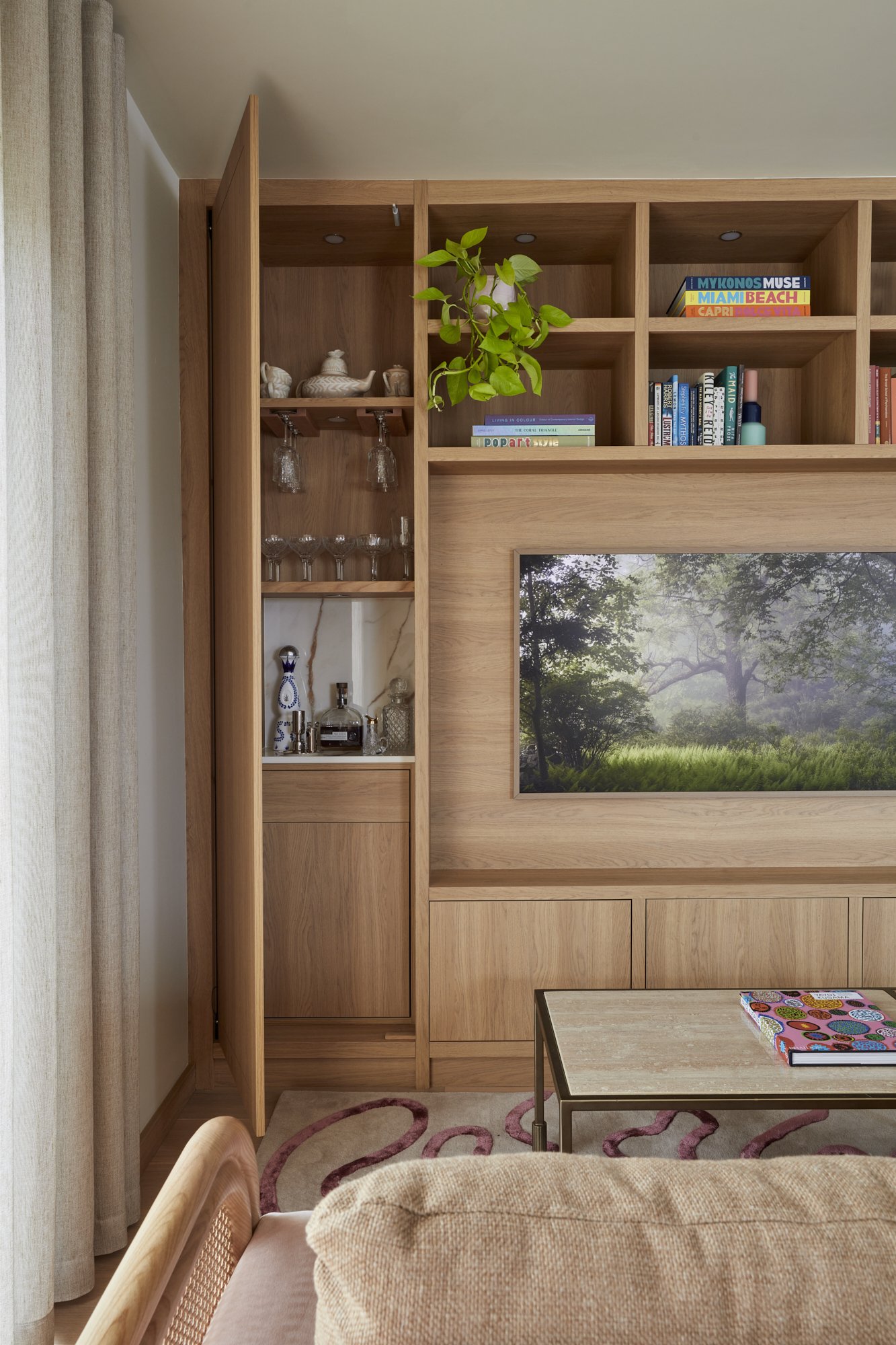
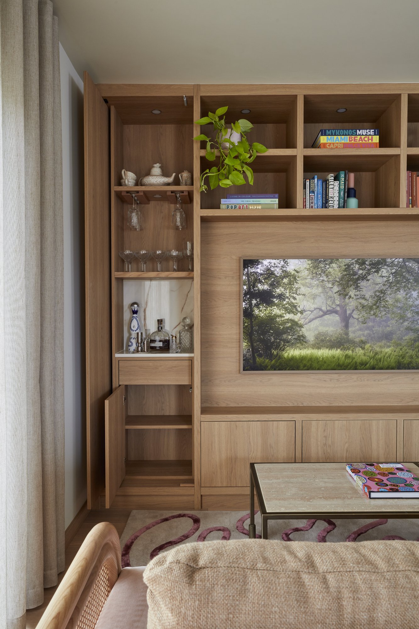
In the living room, the standout is the multifunctional media wall, offering a variety of cupboards and display shelves for showcasing the owner's book collection and cherished mementoes from globe-trotting adventures, along with an ingeniously concealed, compact bar area.
THE SITTING AREA_
The media setup and sofa frame were crafted in light oak to provide a solid foundation for the room's design, creating a stage for the decorative accents to truly stand out.
THE HALLWAY_
This view highlights the panelling's success in adding both style and practicality, seamlessly linking the spaces with a unified design element.
THE BATHROOM_
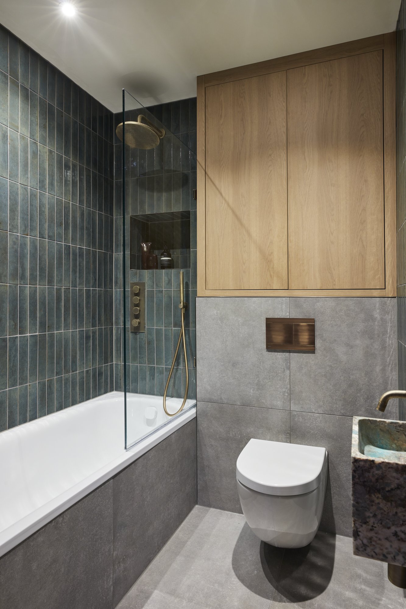
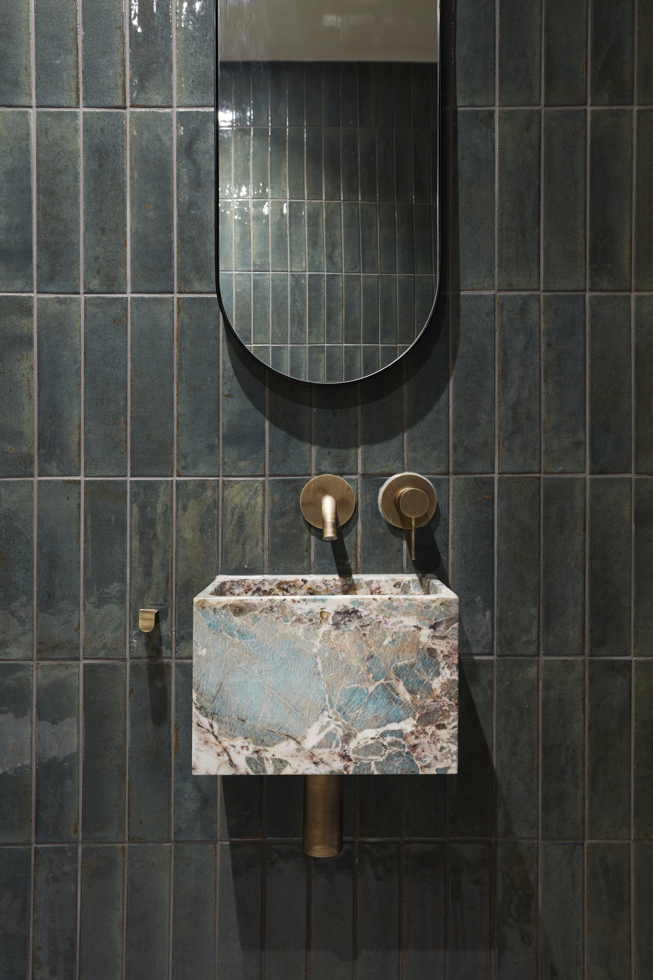
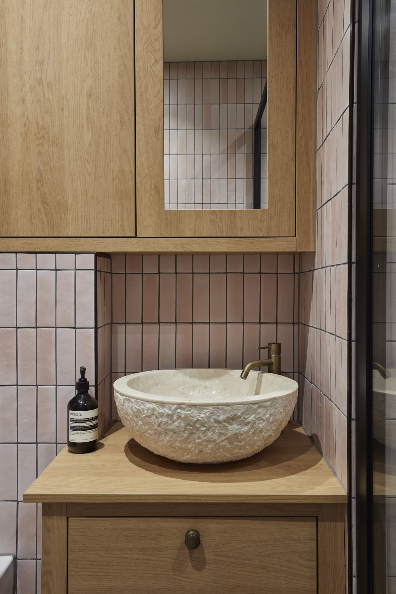
This space reflects a deliberate design choice for a darker, more striking aesthetic that balances boldness with sophistication, ideal for entertaining. The highlight is the beautifully compact sink, celebrated for its standout design.
THE MASTER BEDROOM_
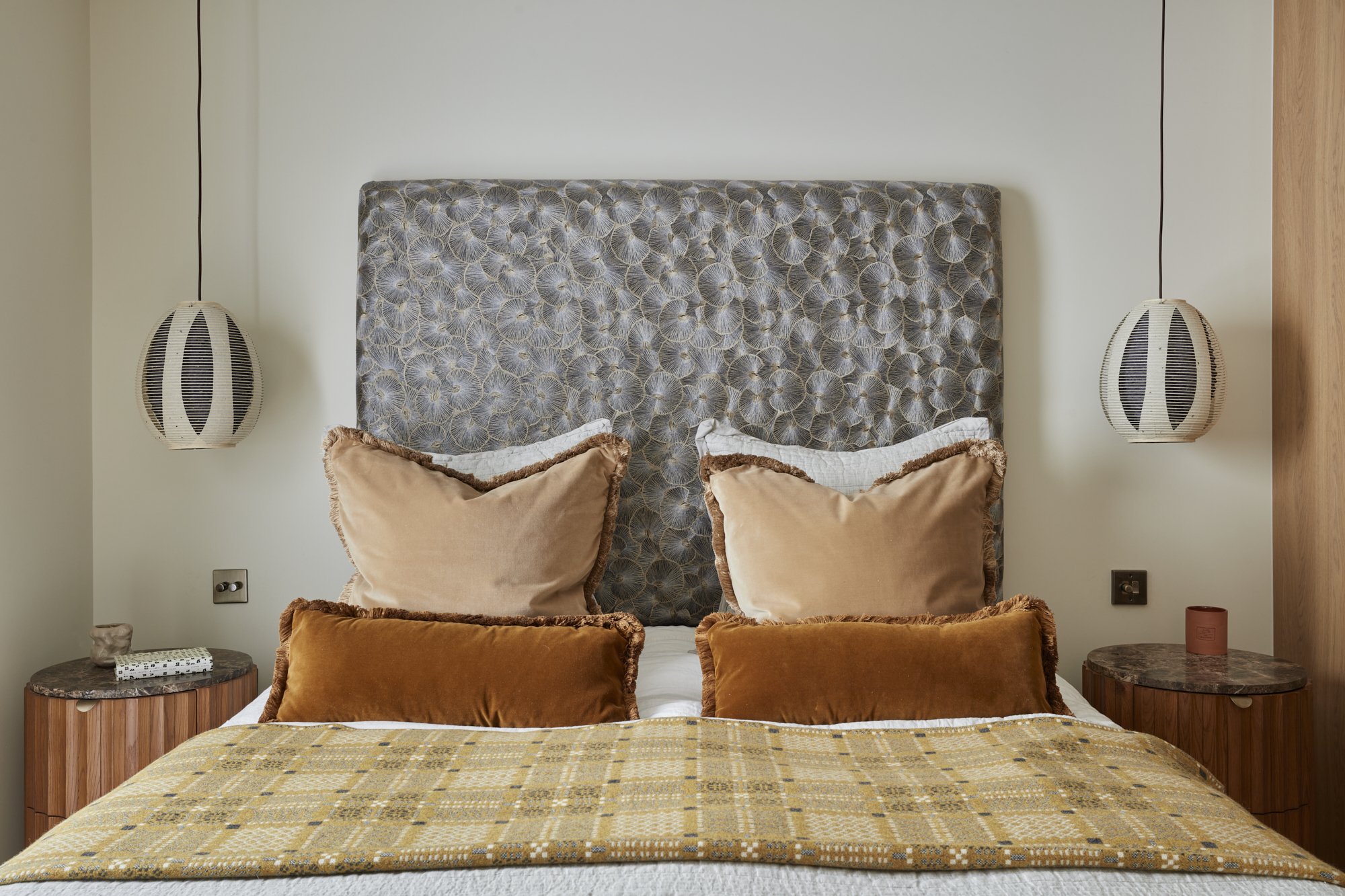
The captivating hues and lotus effect of the dual-toned fabric on the headboard make a dramatic statement, serving as an ideal canvas for the room's diverse colours and textures. A visually pleasing pathway adorned with antique bronze trimming, echoing the wardrobe handles and matching the ensuite's floor tiles, leads through the space. The wardrobes feature a fabric inlay, adding a touch of softness. The strategic use of layered textiles enriches the space with depth, offering a chic way to infuse personality into a compact area.
THE ENSUITE_
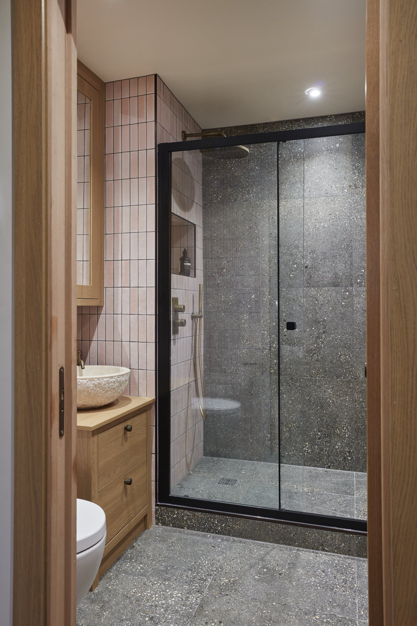
This area was redesigned to accommodate a spacious walk-in shower, now twice its initial size, complete with additional storage for a wall cabinet and vanity unit. The soothing palette of pink and grey tiles yields a tranquil ambience.
THE STUDY/GUEST BEDROOM_
Flexible furnishings were selected for their ability to be repurposed as the family's needs evolve over the years.
Are you inspired to start your design journey? Contact Space Shack for a consultation where we can bring your dream space to life. Visit our contact page, drop us an email, and let's begin creating together.


