TOTTENHAM
Japandi and Zen elements combine with streamlined simplicity in this North London renovation
‘We fused rustic finishes and natural materials with a rigorous approach to layout and furniture placement for a home that marries a sense of relaxed earthiness with graphic appeal’
Image: Space Shack
An earthy, undone look belies the attention to detail behind the creative renovation of this Victorian home in North London, whose classic bones have been reframed via creative finishes and artisanal touches thanks to designer Omar Bhatti and his team at design studio Space Shack.
Image: Space Shack
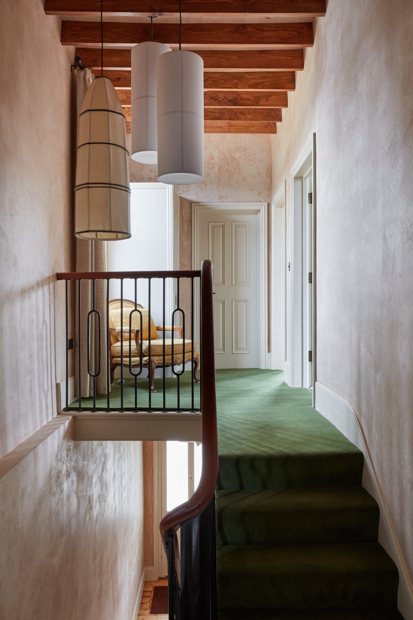
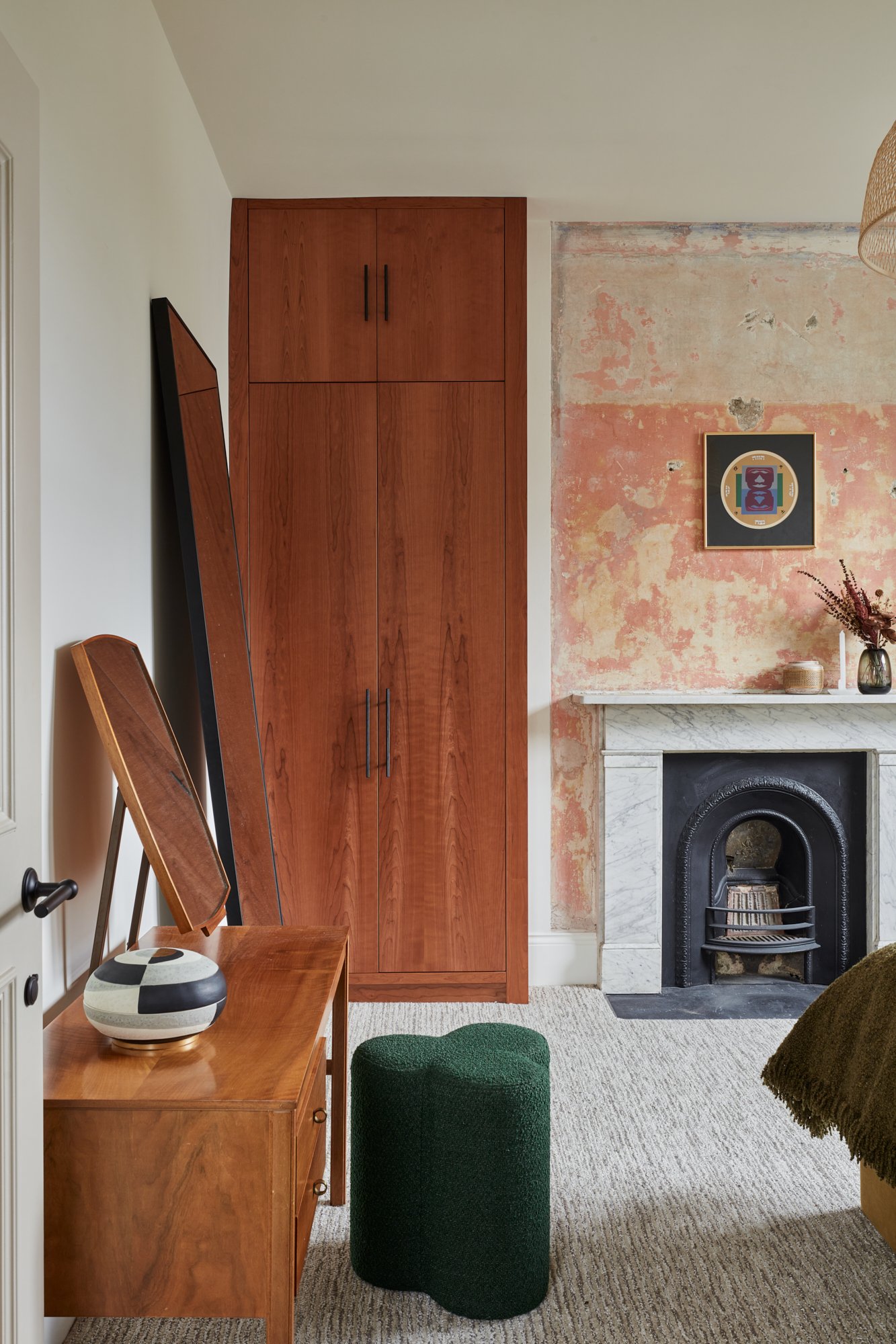
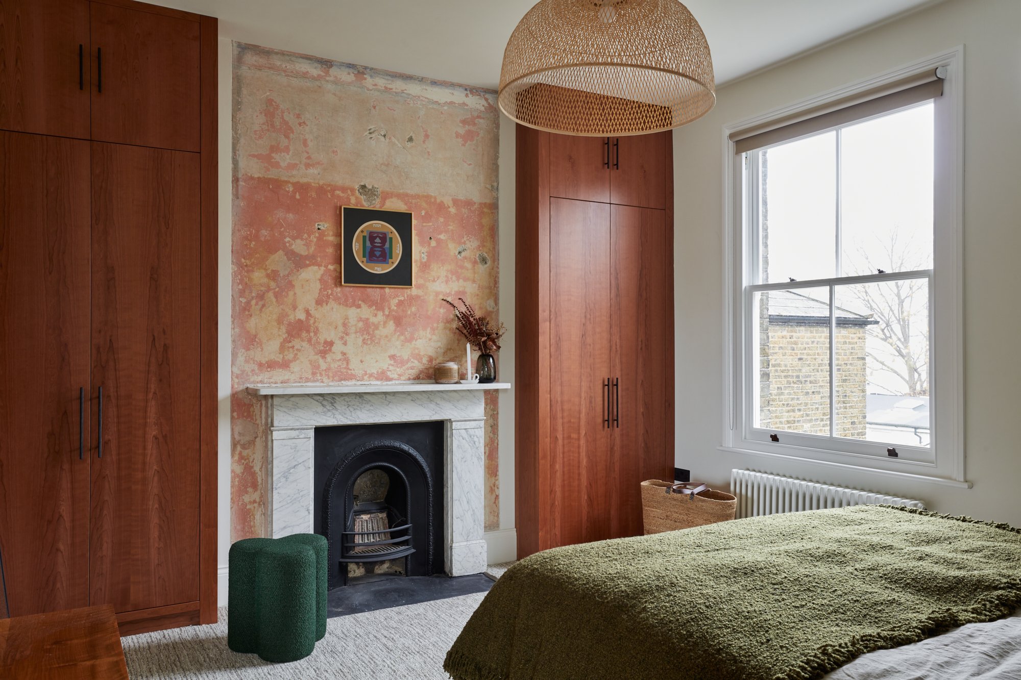
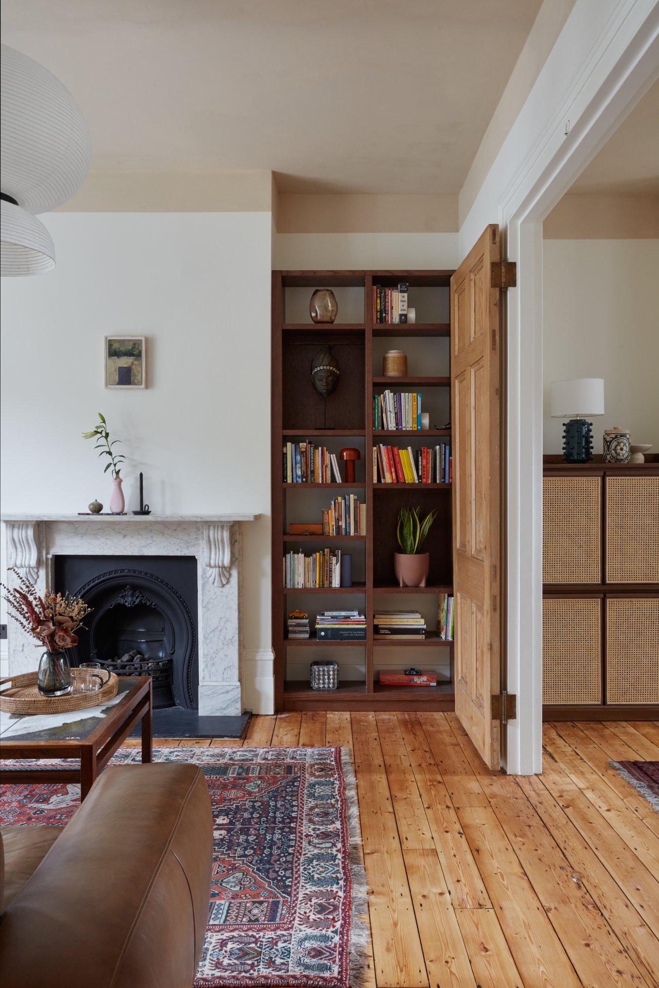
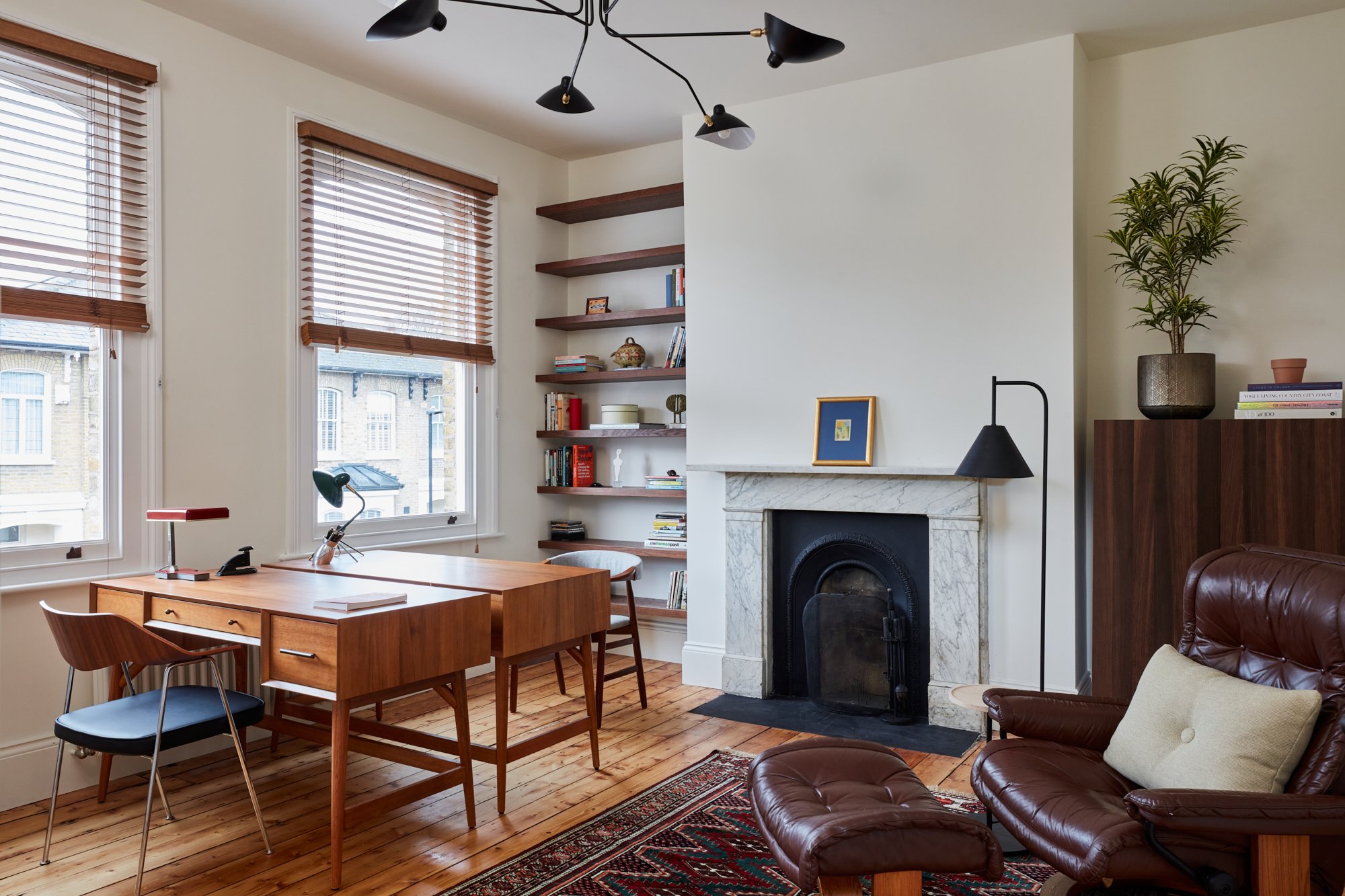
An unusual fusion of clean, streamlined architecture (coving, cornicing and dado rails have been forsaken) and original detailing, such as restored fireplaces and sanded flooring and doors, combine to infuse this five bedroom home with a sense of simplicity and warmth. Guided by the owners’ love of mid-century furnishings, ethnic pieces, textural finishes and the principal of wabi-sabi, Space Shack have created a serene space that features some unexpected treatments. In the entrance hall, walls and ceilings have been given a raw plaster finish, complemented by contemporary black metal stair spindles and a mahogany handrail restored by Priest Brothers. Avocado-toned carpet and a fluid, fabric pendant light add retro appeal. In the main bedroom, layers of paint and paper, discovered during the renovation, have been retained over the chimneybreast, adding natural patina. Either side of it, cherry wood cabinetry lends depth. That motif feature is repeated in the study, where an area of exposed wall, featuring layers of lining paper and plaster, is framed like a portrait. On the upper landing, wooden beams have been newly installed to add texture, while in an adjoining corridor, the ceiling has been clad with cork tiles.
Image: Space Shack
‘Our challenge was to imbue warmth and character without sacrificing the simple, graphic lines of the newly restored space,’ says Omar. ‘That meant introducing finishes that sit in harmony with the bones of the property, and choosing considered furniture pieces with timeless, mid-century appeal.’
Image: Space Shack
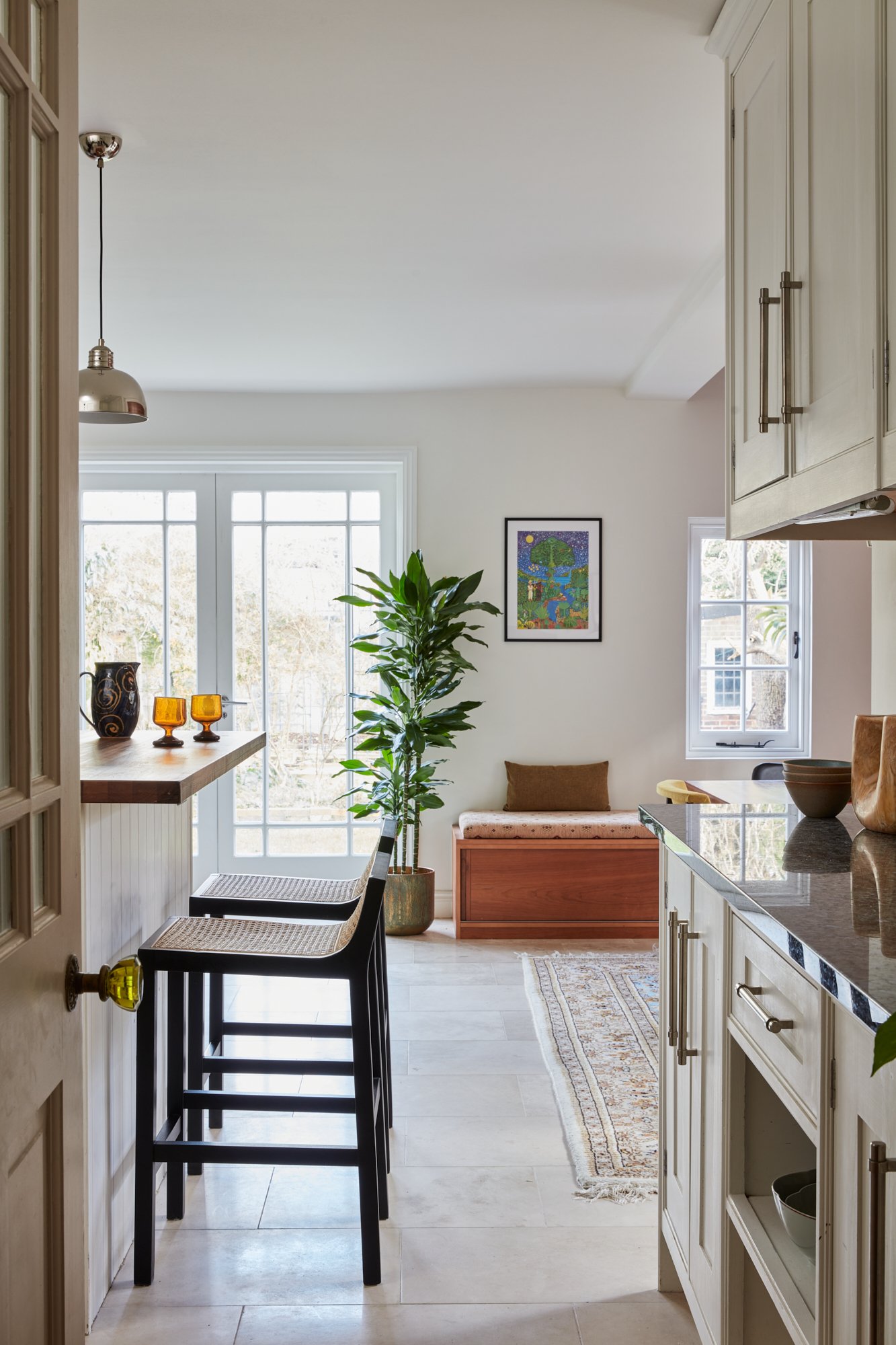
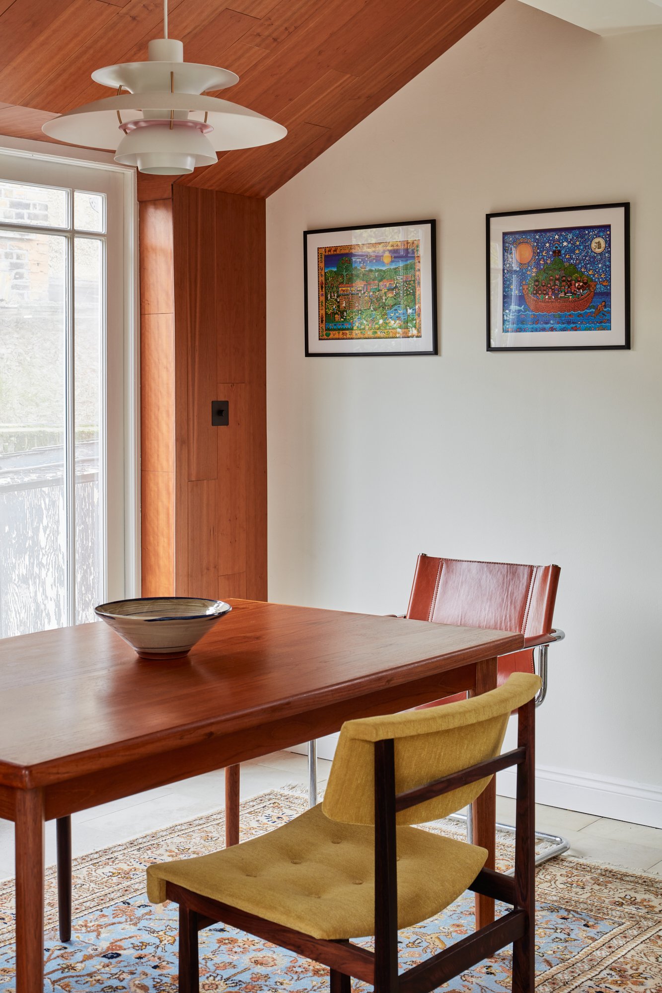
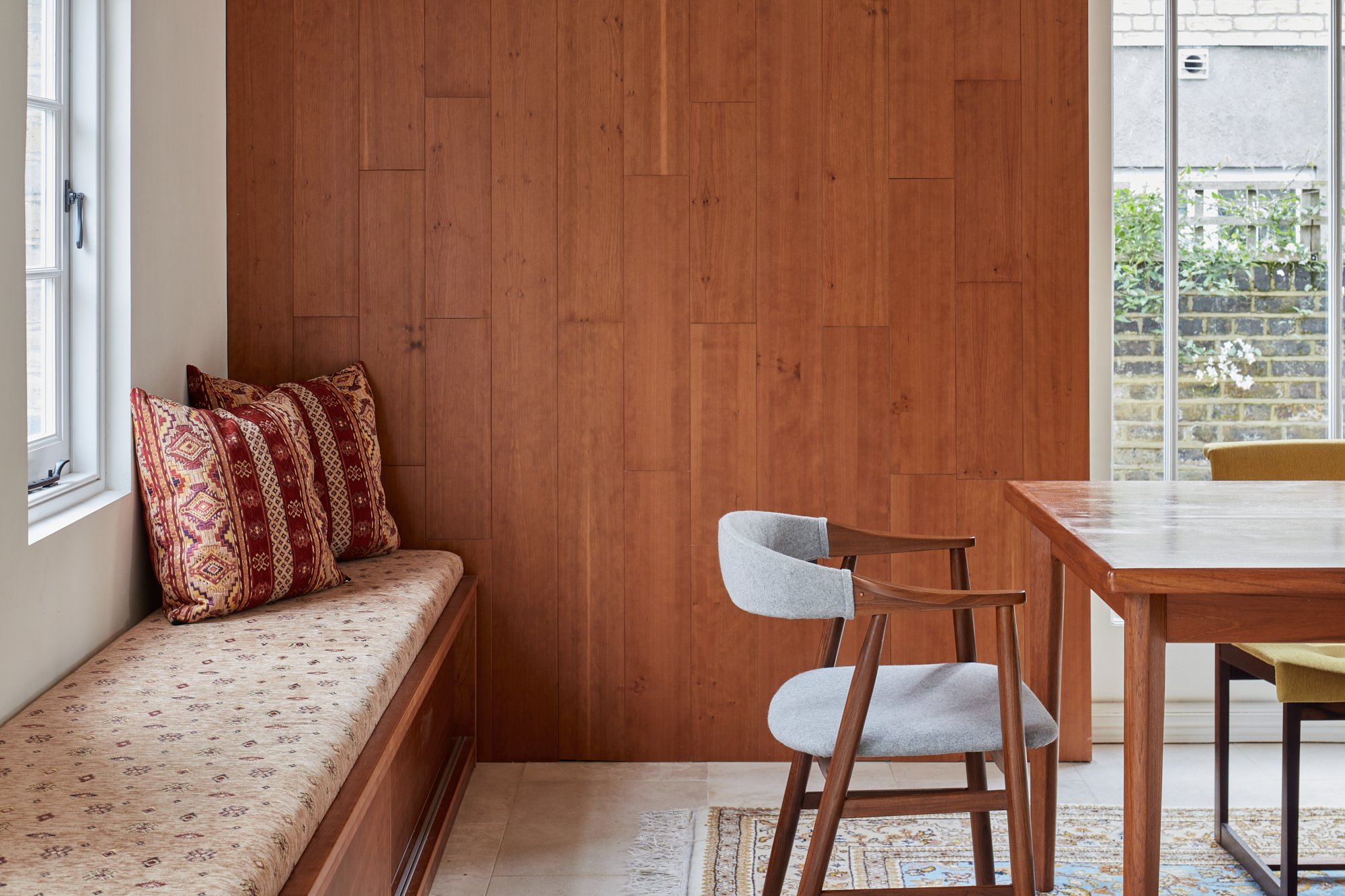
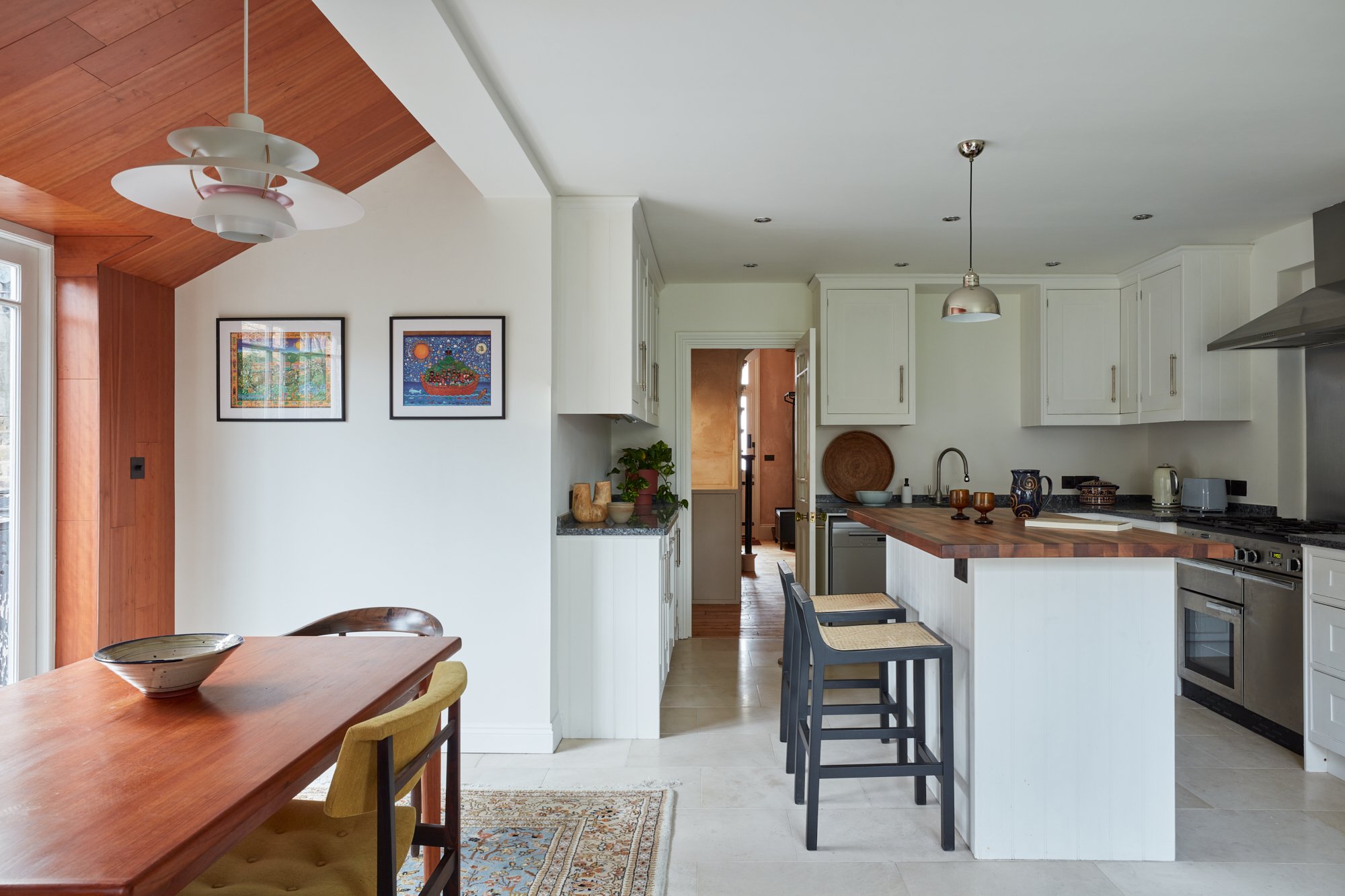
A bold motif is the addition of a cherry wood wall panel stretching into the pitched roof space in the kitchen-diner, complemented by a built-in window seat-cum-storage bench in the same finish. ‘The owners wanted to refresh the kitchen, rather than replace it, so we channelled a relaxed, mid-century style with those warm wood additions and mismatched vintage dining chairs,’ says Omar. ‘We upholstered the bench in a Turkish fabric to reflect the heritage of the owners, who have recently moved to the UK from Australia. We also opted for Turkish tiles in the bathroom for a note of cohesion.’
Image: Space Shack
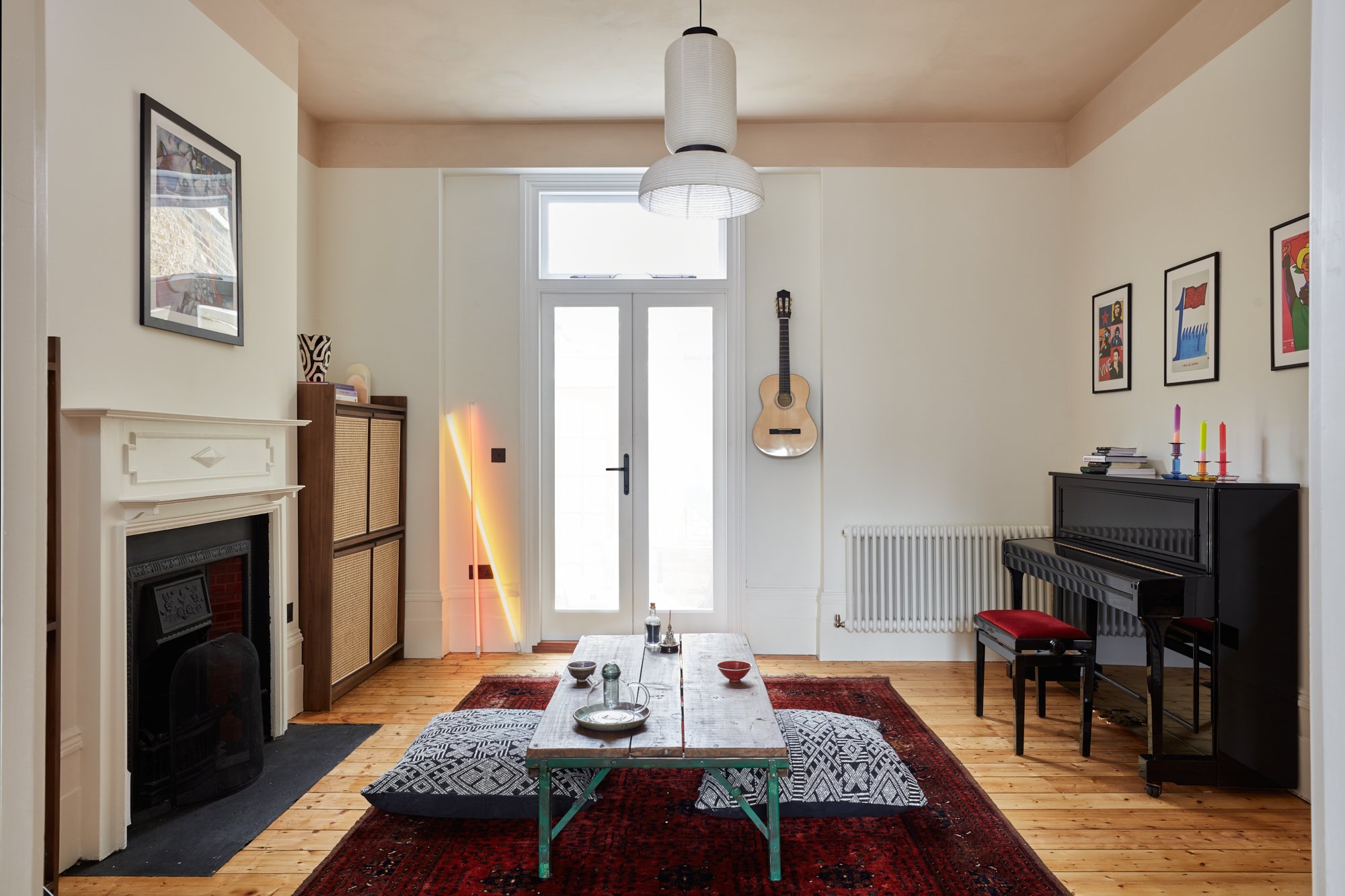
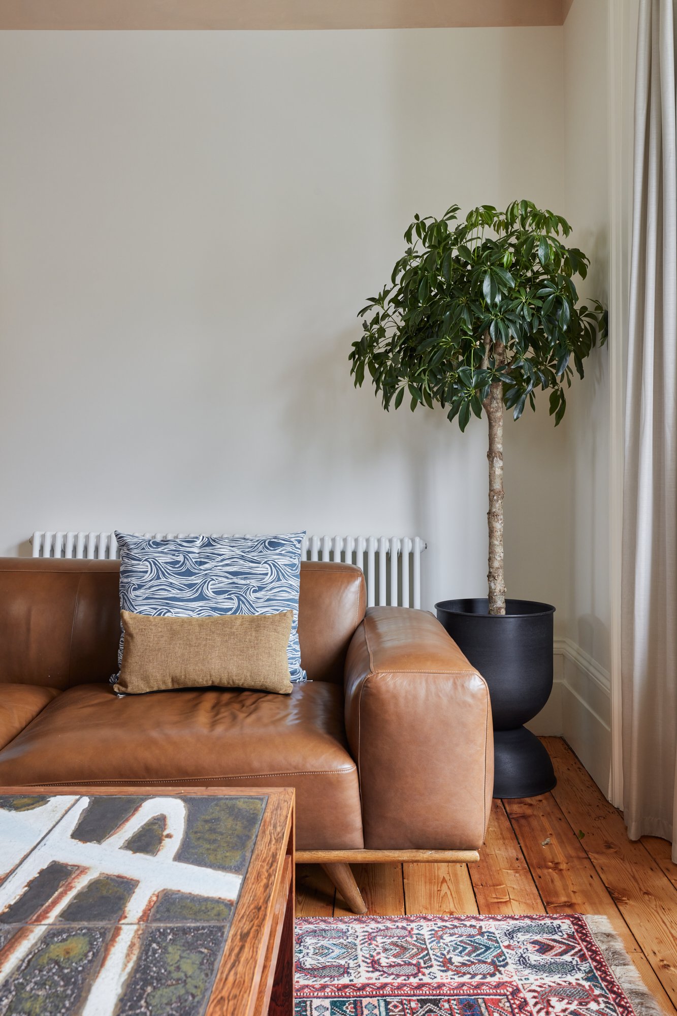
Central to the success of this renovation is a considered selection of furniture pieces, many of them mid-century, and all of them placed with room to breathe. In the sitting room, a coffee table inlaid with hand-painted ceramic tiles by Ole Bjørn Krüger is complemented by bespoke cabinetry and shelving designed by Space Shack and made by Priest Brothers. In the adjoining living space, a low table, generous floor cushions and rattan-fronted cabinetry hint at the art of Eastern hospitality. It all adds up to a home that respects its period roots while harnessing the power of modern simplicity.
Image: Space Shack
Love Omar x
To contact us or find out more about Space Shack arrange your Design Discovery Call or follow us on Instagram.


