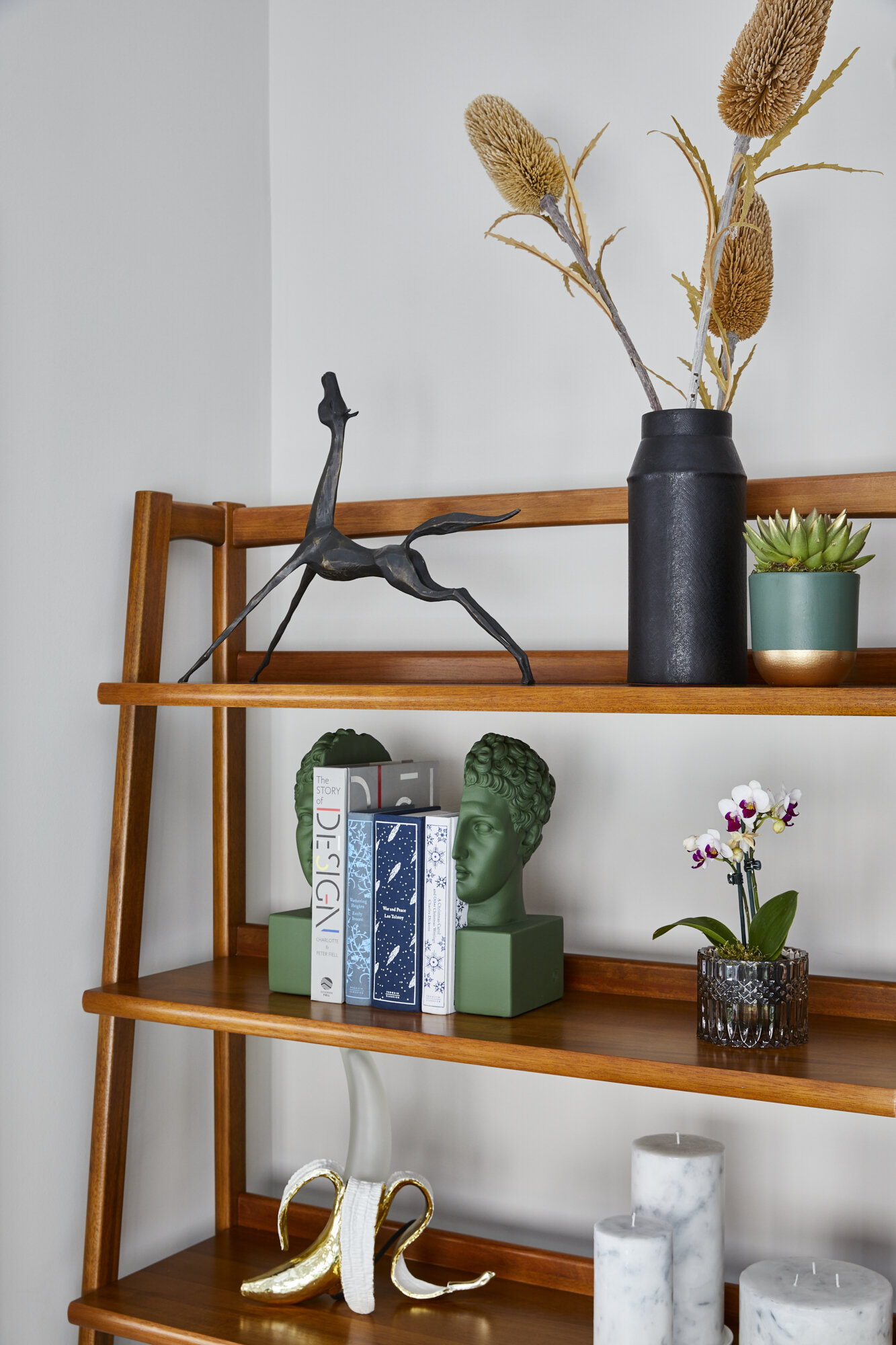
HOW TO STYLE UP YOUR SHELF
A shelf is an empty stage for many beautifully unique pieces people have collected on their travels to shine. Styling your shelf is a creative way to express your style and personality, it may just be the home to some of the most sentimental pieces you own. However, the key is to do them justice! Styling a shelf can be quite a difficult task although it may seem easy, one wrong move throws the whole balance and looks off. As William Morris said, “if you want a golden rule that will fit everything, this is it: Have nothing in your house that you do not know to be useful or believe to be beautiful”.
SIMPLICITY IS KEY
In preparation for styling your shelf, choose items that you believe to be useful or unique. The key is not to clutter. This is a mistake that many people make, it does not allow the more interesting pieces to stand out. You want each individual item to have an impact, less is more.
In the same respect try not to style with too many small objects, not only does this add to the clutter but it also affects the balance of the display. Do not be afraid to allow large and dramatic pieces to stand alone, spacing within the shelves attracts the eye. Be simplistic within in your colour palette, with only hints of colour as this allows certain objects you may want to stand out more... too much colour will distract the eye.
Images: Space Shack
BALANCE
Balance is one of the most important aspects to consider when styling a shelf, if the balance is off it ruins the look of the display and reflects a feeling of uncertainty. Work in groups of three, odd numbers in this case are more aesthetically pleasing on the eye and displays more of a balance.
Try to have a balance within the shapes you use, balance tall objects with shorter ones and avoid similar size objects from sitting close together. Work in diagonals, allow some of the shelves to horizontally mirror previous ones. This creates a perfect balance with the shapes and heights used on your shelf. To create a relaxed look, change levels of stacking evenly, stand some books up and lay others flat to ground your display.
Make sure you are following your colour palette, balance out certain colours evenly especially the bolder ones. Arrange books by the colour of their spines, this allows a pop of colour whilst not being too much and a balance across different shelves. When layering try to layer with only two or three objects, make sure all are different heights and play on displaying some of the objects horizontal and some vertical.
Images: Space Shack
APPLY PERSONALITY
Use unique pieces that add personality or better yet reflect your personality, this allows you to express your design creativity! Artwork allows colour and fun to be added whilst also creating interest in the display.
Unique sculptures are also a brilliant feature to have as they add in shape and texture, they can also be used as an interesting bookend. Particularly circular sculptures act well as a bookend. Picture frames are also a lovely sentimental piece to add in however be careful with colours, continue to consider your colour palette. Layering with artwork and pictures frames can also create an interesting depth to the shelf.
Images: Space Shack
THEME
Give the shelf a theme that flows throughout, perhaps design books alongside old cameras and paintbrushes or maybe more decorative pieces such as mirrors, candles and baskets. However, this can also depend on which room your shelves are in. For example, if you are styling shelves in a kitchen your theme will be glasses, bowls etc. This will also reflect your personality in the display and add interest. Whilst doing this create harmony within your colour palette, this will allow you to bring in more textures and materials. Consider metallic accents, these can be eye-catching and adds sophistication however stick to either brass or chrome.
Images: Space Shack
INJECT LIFE
Plants bring in a sense of nature and life to the display. They are a brilliant décor piece to use in any space, as they not only make us feel calm and relaxed but improve air quality and reduce blood pressure. They also bring in a lovely pop of rich green to the colour palette whilst being subtle and natural. Adding in foliage creates an aesthetically pleasing look and allows you to change up the look of your shelf with the seasons. For example, trailing plants create a beautiful feel of life and texture whilst hanging perfectly alongside a piece of artwork or photo frame.
Images: Space Shack
Let us know your thoughts about these shelves styling tips and how are you going to be implementing them on your next project.
Love Omar x
To contact us or find out more about Space Shack arrange your Design Discovery Call or follow us on Instagram and Facebook.


